Flexbox
{ The yoga of CSS }
Text
Layouts
{ and how to get them right }

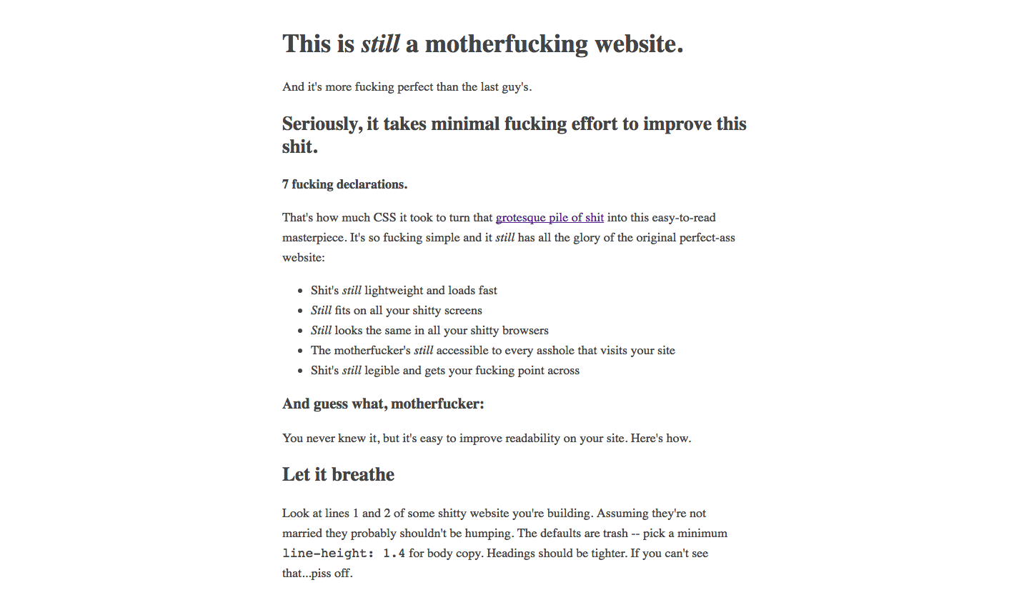
(*) This is satire
*


CSS layout modes are algorithms determining the position and the size of boxes based on the way they interact with their sibling and ancestor boxes
{ display: block; }
The good ol' way
Make me float: right;
- A block element
{ display: block; }
{ display: table; }
The anti-hero
Chakras
- Not an HTML table
- Allows proper vertical alignment
- Gets the job done
- ...

Tables are bad!
- Some website out there
(for layout)
- Limit what you can do in terms of layout
- Make redesigns MUCH harder
- Semantically incorrect
{ display: table; }
Tables are for Tabular Data. Period.
- Another website
{ display: flex; }
- Aligns and distributes space among items in a container
- Vertical and horizontal flows
- Makes devs happy!
Chakras

I want to marry flexbox, man
- Ilias Trichopoulos
{ display: flex; }
Time to flex!
{ The hands-on workshop starts now }
flex container
flex item
flex item
flex item
.container {
  display: flex;
}
{ display: flex; }

.container {
  display: flex;
  justify-content: ...;
}
{ justify-content }
Exercise #1

.container {
  display: flex;
  align-items: ...;
}
{ align-items }

Exercise #2

.container {
  display: flex;
  flex-wrap: wrap;
}
{ flex-wrap }

.container {
  display: flex;
  align-content: ...;
}
{ align-content }

Exercise #3

.container {
  display: flex;
}

.item {
  flex-grow: 1;
}

.item2 {
  flex-grow: 2;
}
{ flex-grow }

0
0
0
Exercise #4

.container {
  display: flex;
}

.item {
  align-self: ...;
}
{ align-self }
.item {
  order: <integer>;
}
Exercise #5

Final exercise!

Alejandro Avilés

Ilias Trichopoulos
Flexbox: The yoga of CSS
By Alejandro Avilés (Ome Gak)
Flexbox: The yoga of CSS
Slides for workshop at the 3rd Developers@CERN Forum
- 2,346


